


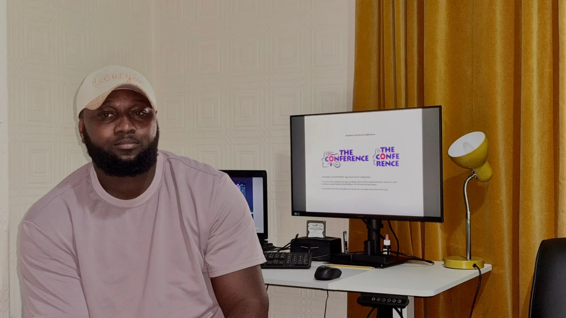
Patrick Osei
Typography has always occupied an interesting place within Ghana’s visual culture. Long before digital design became widely accessible, lettering was embedded in everyday life through hand-painted shop signs, market stalls, commercial vehicles, church posters, product packaging, and roadside advertisements. Many of these letterforms were not produced by formally trained typographers; rather, they emerged from sign painters, printers, illustrators, and local businesses responding creatively to their environments. Letters were stretched, condensed, outlined, shadowed, and painted in colors chosen less by conventional typographic rules and more by the need to communicate, attract attention, and establish identity. For Ghanaian graphic designer Patrick Osei, these everyday forms of lettering represent an important visual language well worth observing and exploring.
Patrick has become increasingly interested in how typography can draw from African environments without depending on the familiar visual stereotypes often associated with African design. Rather than viewing type simply as a vehicle for presenting written information, he approaches letters as carriers of personality, memory, language, and culture.
“Typography interests me because words can communicate visually before someone has even properly read them. The weight, shape, spacing, and arrangement of letters can already create a feeling,” Patrick explains.
His interest in typography developed naturally through his wider practice as a graphic and brand designer. Working regularly with type meant constantly searching for letterforms capable of communicating different personalities. Some projects required a confident and contemporary feel, while others demanded something more expressive, cultural, or human. Over time, this made Patrick question why contemporary African designers so often begin with typefaces developed within completely different cultural environments. He does not see the use of Western typography as a problem in itself, but he believes African designers should be confident enough to examine their own surroundings for inspiration.
“Most of the digital typefaces available to us have been designed somewhere else, and there is nothing wrong with using them,” Patrick notes. “What interests me is the possibility of also looking at Ghana and Africa as places from which new typographic ideas can emerge.”
The Street as an Informal Archive
This curiosity has encouraged Patrick to look more carefully at the typography surrounding him. Ghana’s streets, in particular, have become an informal visual archive. Hand-painted lettering appears outside barbershops, food businesses, and neighbourhood stores, while religious phrases and personal expressions adorn commercial vehicles. Market traders use bold lettering to communicate products and prices, and churches combine enormous headlines, expressive type, and tightly arranged information to promote programs and conventions.
Some of these examples may not follow the principles taught in formal typography education, yet they communicate with remarkable confidence. Patrick is especially drawn to the imperfections found within this vernacular lettering.
“When something has been painted by hand, every letter isn’t necessarily identical. The spacing might change and the proportions might be slightly different, but those differences can give the lettering personality. You can feel that a person made it.”
Instead of reproducing these examples directly, Patrick studies what makes them visually effective. Sometimes it is the exaggerated scale of the lettering; in other cases, it is the contrast between colors, the unusual construction of a character, or the confidence with which words occupy an entire surface. He seeks to understand these qualities and consider how they might inform contemporary typography. For him, observing Ghanaian vernacular lettering is not about romanticising imperfect design, but recognizing that valuable visual ideas can exist outside formal design studios, universities, and digital type libraries.
This perspective also shapes Patrick’s thoughts on the potential evolution of African typography. African graphic design is frequently represented internationally through familiar visual devices such as traditional patterns, symbolic motifs, earthy colors, and decorative elements. While Patrick recognizes the cultural importance of these references, he does not believe they should define the boundaries of African visual expression.
“I don’t think adding an African pattern or symbol to letters automatically makes the typography African,” he says. “Our culture can influence type in much deeper ways. It can come through language, rhythm, the streets, the way signs are painted, and the way people communicate with one another.”
Redefining African Visual Identity
For Patrick, contemporary African typography should have the freedom to be minimal, geometric, experimental, expressive, or restrained. It can participate comfortably within international design while remaining firmly rooted in African experiences. His interest lies less in creating typography that immediately announces itself as African, and more in exploring how Ghanaian and African experiences might contribute to a broader contemporary typographic vocabulary. The objective is not to force culture into every letterform, but to allow culture to influence the underlying thinking behind the design.
Language is particularly vital within this exploration. Ghana boasts a rich linguistic landscape where English exists alongside Twi, Fante, Ga, Ewe, Dagbani, and numerous other languages. These languages contain words and expressions carrying unique sounds, rhythms, and cultural meanings. Patrick believes this creates vast possibilities for typographic experimentation.
“There are Ghanaian words and expressions that immediately connect you to a particular place, person, or experience. I am interested in how typography can give those words another level of visual expression.”
Rather than treating language simply as text that must fit neatly within a composition, he considers how words themselves can become graphic material. Individual letters can transform into shapes, repeated phrases can establish rhythm, and familiar expressions can serve as the central visual element of a composition.
Patrick’s creative process often begins with observation and research. He pays close attention to signage, posters, packaging, lettering, and other forms of everyday communication, collecting photographs and references that contain interesting typographic characteristics. From there, he begins sketching and experimenting with the construction of individual characters. The goal is not to trace an existing sign and reproduce it digitally, but to understand why a particular piece of lettering caught his attention. An unusually wide character, an unexpected curve, an imperfect baseline, or a distinctive terminal can spark an entirely new typographic experiment.
Once an initial direction is established, Patrick moves fluidly between experimentation and refinement. Letterforms are adjusted, proportions reconsidered, and spacing repeatedly tested. What begins as a spontaneous observation gradually matures into a controlled visual system.
“The process makes you pay attention to details that most people might never notice. Moving a letter slightly or changing the shape of one character can affect how an entire word feels. That attention to detail is one of the things I enjoy about typography.”
Precision Meets Human Character
This relationship between imperfection and precision has become a cornerstone of his work. Digital design tools make it possible to create near-perfect consistency, aligning objects instantly and reproducing characters identically. Yet many of the vernacular references inspiring Patrick were created without these advantages. Their irregularities reveal something intimate about the people who made them. He believes contemporary typography can learn from that human quality without deliberately manufacturing poor construction. The challenge lies in determining which characteristics give lettering personality and which hinder its functionality.
“I like clean and precise typography, but I also think there are moments when making everything perfect can remove some of its character,” Patrick reflects. “Sometimes a small irregularity can make something feel much more alive.”
Underlying Patrick’s exploration is his broader belief that typography functions as storytelling. Letters operate simultaneously as language and image, allowing designers to communicate what a word means while influencing how that word feels. He compares typography to nuances in spoken communication: the exact same sentence can be whispered, shouted, or spoken confidently, producing a different emotional response each time. Typography performs a similar visual role. A heavy display typeface might make a message feel commanding, while irregular lettering introduces spontaneity and movement. A restrained serif can communicate heritage or authority, while scale, spacing, and composition completely alter how audiences experience a word.
Patrick’s exploration also feeds into a broader conversation about contemporary African visual identity. Designers across the continent now enjoy unprecedented access to international creative references, software, and digital resources, allowing a designer in Accra to observe work produced in Lagos, London, Amsterdam, Tokyo, or New York almost instantly. While Patrick values this accessibility, he is equally mindful of the risk of visual homogenization when designers everywhere consume the same references and utilize the same tools and typefaces.
“We should absolutely learn from international design, but we should also recognize that there are visual references around us that designers somewhere else may never encounter. Those references can give us something different to contribute.”
For Patrick, Ghana represents far more than a geographical background; it provides an extensive, living visual resource. The lettering painted across a neighbourhood storefront, words displayed on a commercial vehicle, a church program poster, or a market trader’s handmade sign all contain ideas worth documenting. Because these examples risk disappearing as businesses increasingly replace hand-painted communication with digitally printed graphics, Patrick views observation and documentation as a vital way to preserve Ghana’s changing visual culture while generating material for new contemporary ideas.
Ultimately, Patrick Osei’s exploration of typography remains an evolving pillar of his creative practice. He intends to continue studying Ghanaian vernacular lettering, experimenting with custom letterforms, and investigating how African languages and contemporary experiences can inform new typographic systems. He is particularly driven to develop work that avoids merely imitating historical visual references, transforming them instead into something capable of thriving within contemporary graphic design.
“For me, the exciting question isn’t only what African typography looked like before,” Patrick concludes. “It is also what it can look like next. I want to explore typography that feels contemporary and can communicate internationally while still having a story and a sense of where some of its character comes from.”
For Patrick Osei, bringing African expression to typography is not about making every letter immediately appear African, nor is it about rejecting the influence of international design. It is about recognizing that Ghana already possesses a rich visual language within its streets, signs, languages, and everyday communication and understanding that these references can contribute meaningfully to contemporary typography. By looking closely at his surrounding visual culture and combining those observations with experimentation and digital precision, Patrick is exploring how letters can become much more than vehicles for words. They are records of place, expressions of identity, and new ways of telling African stories through design.
