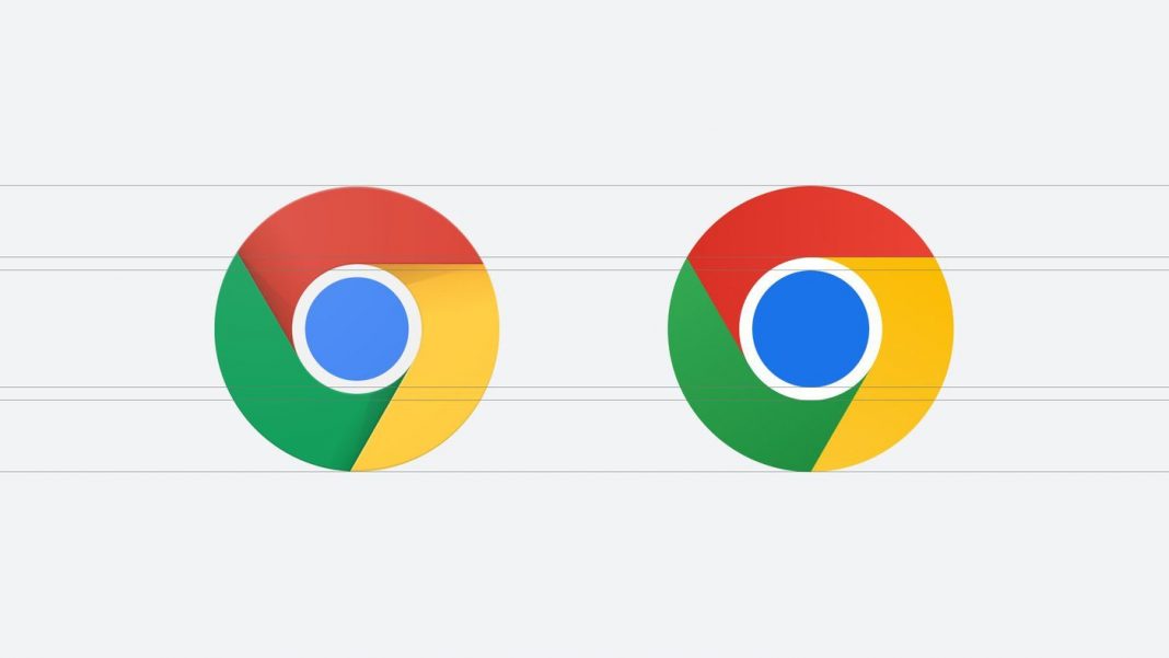
Google Chrome should have the logo changed in 2022, something that hasn’t happened since 2014. The redesigned look is very subtle and maintains the idea of previous versions, with additions that only the most attentive should notice.
The Chrome icon will now be completely flat, with no nuance or shading to make it look streamlined. In the current model, the shadows between the colors convey a feeling of “height”, as if the browser symbol were a fan blade.
Some of you might have noticed a new icon in Chrome’s Canary update today. Yes! we’re refreshing Chrome’s brand icons for the first time in 8 years. The new icons will start to appear across your devices soon. pic.twitter.com/aaaRRzFLI1
— Elvin 🌈 (@elvin_not_11) February 4, 2022
Want to stay on top of the best tech news of the day? Access and subscribe to our new youtube channel, Kenyannews News. Every day a summary of the main news from the tech world for you!
In the center, the blue circle with the white ring around it has taken on a darker hue. This core is a little bigger than before and with more contrast in relation to the other colors. The images were shared by Chrome designer Elvin on his Twitter profile.
A curiosity is that this new art will not look the same on all systems. On Chrome OS, for example, the image will be more colorful to stand out among the other system icons, while on macOS there will be a small shadow behind to give the dock a three-dimensional feel. On Windows 10 and 11, the image must adopt a gradient tone to fit the style of the other system shortcuts.
single color versions
There are also new icons for the Beta and Dev channel versions of the program. In this case, there will be banners named Beta (or “B” if it’s a reduced size icon) or Dev. On iOS, the Beta app will start using a single blue color design (similar to the Canary yellow), as a reference to Apple’s developer-focused apps — the stable app icon will get new proportions.
On iOS, our Beta app will start using a blueprint-like design, as a nod to Apple’s developer-focused apps, and the Stable app icon will have new proportions on the tile. pic.twitter.com/kkIeJkv8Uj
— Elvin 🌈 (@elvin_not_11) February 4, 2022
For now, the new icon is only available for users of Chrome Canary, the developer version of the browser, but there are plans for a worldwide release in the coming months. As there was no official statement from Google, it is still too early to estimate a date, but it shouldn’t take too long.
The evolution of the Chrome logo made the image more and more simple. What started out as a three-dimensional image with a chrome look has been tweaked to resemble a fan and is now a mere 2D circle with four distinct colors. The simplification followed the design trend of the last few years, in which flat and minimalist icons took over the market.
